In summary:
- Move beyond identical matching by focusing on coordination through a shared color story, varied textures, and distinct silhouettes.
- Incorporate different fabrics like knits and cottons to add visual depth and interact beautifully with light.
- Prioritize comfort, especially for sensory-sensitive children, by choosing soft, tagless fabrics and conducting a full “dress rehearsal” before the shoot.
- Build a timeless wardrobe by leaning on an 80/20 rule: 80% neutral basics and 20% classic patterns or prints for personality.
- Extend the life of special occasion outfits by deconstructing them and pairing formal pieces with casual staples for everyday wear.
As a family photographer, I’ve seen it all: the perfectly pressed matching sailor suits, the identical plaid dresses, the uniform of white shirts and denim. The intention is always pure—to create a visual harmony that says “we are a family.” Yet, the result can often fall flat, creating a wall of fabric that masks the very things we want to capture: the unique spark in each child’s eye, their individual spirit, and the authentic connection between them. The fear of looking “tacky” is real, but the solution isn’t a rigid set of rules. It’s an artistic shift in perspective.
The common advice to “coordinate, don’t match” is a starting point, but it’s incomplete. True mastery lies in understanding *why* certain combinations work. It’s about composing a visual story where each child is a distinct, yet connected, character. This guide moves beyond the basics of picking a color palette. We’ll explore how to use the “textural dialogue” between a chunky knit and smooth cotton, how to build a “color story” that feels both unified and personal, and how to balance the “visual weight” of patterns and solids. The goal is to curate a collection of outfits that not only look stunning on camera but also allow your children’s personalities to be the true focus of the portrait.
This article will guide you through the key principles of artful sibling styling. We will deconstruct the visual science of photography, provide actionable strategies for everything from color selection to managing comfort, and empower you to create a look that is timeless, cohesive, and deeply authentic.
Summary: A Photographer’s Guide to Styling Siblings
- Why Identical Outfits Often Look Flat in Professional Photos?
- How to Mix Knits and Cottons to Add Depth to Studio Lighting?
- Earthy Tones or Pastels: Which Palette Works for Both Brothers and Sisters?
- The “Itchy Tag” Meltdown: Strategies for Sensory-Sensitive Siblings
- How to Style Formal Set Pieces for Casual School Days?
- Neutral Basics vs. Trendy Prints: Which Offers More Outfit Combinations?
- Strict vs. Permissive: How to Present a United Front to Kids?
- How to Dress Kids for Summer Weddings Without Causing Meltdowns?
Why Identical Outfits Often Look Flat in Professional Photos?
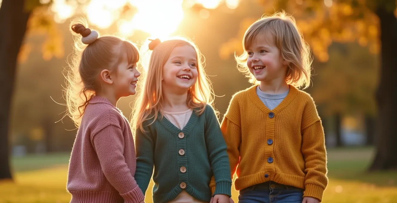
The core issue with identical outfits is that they create a uniform block of color and shape that competes for attention. Instead of seeing individual children, the viewer’s eye is drawn to the pattern of repetition. This visual shortcut can inadvertently flatten the image, reducing the perceived depth and, more importantly, overshadowing the unique personalities you want to celebrate. When everyone wears the same thing, the outfit becomes the subject, not the people wearing it.
According to photography experts at Sugar Bee Clothing, this is a common pitfall. Their analysis highlights a key psychological effect: when siblings wear identical outfits, the viewer’s brain registers ‘the outfits’ first, and the children’s individual faces and personalities second. They emphasize that allowing each child to express their personality through their clothing can result in more authentic and joyful photos. The goal is to create harmony, not homogeneity. This is achieved through coordination—sharing a common theme, color, or texture—rather than duplication.
Think of your family photo as a composition. An artist wouldn’t paint every element in the exact same way. Instead, they would use variations in shape, texture, and tone to create interest and guide the viewer’s eye. By varying the silhouettes and fabrics among your children, even within a tight color scheme, you create visual rhythm. A dress on one child and a shirt-and-pants combination on another breaks up the monotony and allows each child to occupy their own space within the frame, contributing to a richer, more dynamic final portrait.
How to Mix Knits and Cottons to Add Depth to Studio Lighting?
One of the most powerful tools in a stylist’s kit is texture. It’s the secret ingredient that transforms a flat image into one with tactile depth and dimension, especially under the controlled conditions of studio lighting. Mixing fabrics like knits and cottons isn’t just a stylistic choice; it’s a technical one that manipulates how light behaves in your photograph. Each fabric has a unique relationship with light, creating a “textural dialogue” that adds sophisticated visual interest.
A chunky knit sweater, for instance, is a landscape of tiny hills and valleys. Under a studio light, those raised patterns catch highlights while the crevices fall into soft shadow, creating inherent contrast and dimension. In contrast, a crisp cotton poplin shirt absorbs light more evenly, providing a smooth, matte surface that acts as a grounding element in the composition. When you place these two textures side-by-side, you create a dynamic interplay of light and shadow. The knit adds dimension, while the cotton provides stability, preventing the overall image from becoming too busy.
This macro-level detail shot shows the powerful contrast between a soft, light-catching knit and a smooth, matte cotton, demonstrating how texture creates visual depth.

Understanding how different materials behave is key to building a visually rich composition. This is particularly true for creating a balanced look that is neither boring nor overwhelming. The following table breaks down the properties of common fabrics for photoshoots.
| Fabric Type | Light Behavior | Visual Effect | Best For |
|---|---|---|---|
| Knits (Cable, Chunky) | Catches & reflects highlights | Creates dimension & depth | Adding visual interest |
| Cotton (Poplin, Oxford) | Absorbs light evenly | Provides smooth, matte finish | Grounding the composition |
| Linen | Subtle texture with natural drape | Adds organic movement | Outdoor & natural light |
| Corduroy | Creates linear shadows | Adds directional texture | Fall/winter sessions |
By consciously selecting and pairing fabrics based on their light-reflecting properties, you are essentially sculpting the image before the camera even clicks, ensuring a result that is rich, deep, and artistically composed. This approach elevates your family portrait from a simple snapshot to a thoughtful piece of art.
Earthy Tones or Pastels: Which Palette Works for Both Brothers and Sisters?
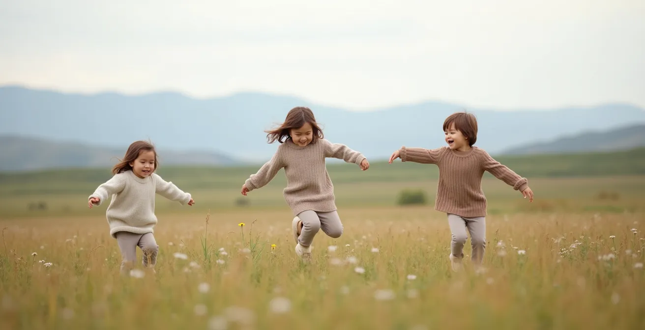
The choice between earthy tones and pastels is less about gender and more about the mood and environment of your photoshoot. Both palettes can work beautifully for brothers and sisters when approached with a “color story” mindset rather than strict color-coding. The key is to select a family of colors that harmonizes with your location and the feeling you want to evoke. Earthy tones (like olive green, terracotta, mustard, and beige) create a warm, grounded, and organic feel, perfect for outdoor sessions in fields or forests. Pastels (like soft blue, blush pink, mint, and buttercup yellow) evoke a light, airy, and whimsical mood, ideal for spring photos or bright, minimalist studio settings.
The trick to making a palette work across genders is to use a “color bridge.” This involves selecting a primary palette of two to three main colors and one or two accent colors. Instead of dressing one child in blue and another in pink, you weave the colors throughout the outfits. For example, if your palette is navy, cream, and dusty rose, a brother could wear navy trousers and a cream sweater, while his sister wears a cream dress with a subtle navy and dusty rose floral print. The colors connect them without being identical.
The styling experts at Carriage Boutique offer a timeless perspective on building these harmonious color stories. As they note, certain combinations have an enduring elegance that transcends fleeting trends.
According to Carriage Boutique’s styling experts, timeless color combinations include: ‘Ivory, white & soft neutrals – Ideal for christenings, weddings, and formal portraits; Pastels (blush, baby blue, mint, lavender) – Perfect for spring and summer events; Navy, cream & soft gray – Elegant and seasonless; Sage, beige & soft brown tones – Earthy, modern, and understated.’
– Carriage Boutique Style Team, Coordinating Sibling Looks for Photos & Special Events
Ultimately, the most successful palettes feel authentic to your family and enhance the environment. Don’t be afraid of traditionally “feminine” or “masculine” colors. A boy can look wonderfully stylish in a soft blush or lavender shirt, just as a girl can look strong and chic in olive or rust. Focus on tonal harmony above all else.
Your Action Plan: Building a ‘Color Bridge’
- Start by choosing 2-3 main colors and 1-2 accent colors for the entire family based on your location and desired mood.
- Dress one sibling in a primary piece in one of your main colors (e.g., a boy in olive green trousers).
- Dress the other sibling in a neutral base from your palette (e.g., a girl in a cream dress).
- Incorporate the first sibling’s main color as a small accent in the second outfit (e.g., the cream dress has an olive green floral print or is paired with an olive green ribbon).
- Use accessories like bows, socks, or shoes to sprinkle the accent colors across all siblings, tying the entire color story together.
The “Itchy Tag” Meltdown: Strategies for Sensory-Sensitive Siblings
All the artistic planning in the world—perfect color stories, beautiful textural dialogues—will instantly crumble if a child is uncomfortable. The infamous “itchy tag” meltdown is a real threat to any family photoshoot. For sensory-sensitive children, a stiff collar, a scratchy seam, or a tight waistband isn’t a minor annoyance; it’s an overwhelming distraction that makes genuine smiles and happy cooperation impossible. Prioritizing sensory comfort is not a compromise; it is the fundamental prerequisite for capturing authentic expressions.
The strategy begins long before the camera comes out. When shopping, actively seek out fabrics known for their softness, such as Pima cotton, bamboo, or modal blends. Always look for tagless designs or be prepared to carefully remove all tags yourself. Pre-washing new clothes is a non-negotiable step; it softens the fabric and removes any residual sizing chemicals from the manufacturing process that can irritate sensitive skin. Pay close attention to fit—avoid anything too restrictive. Opt for pieces with natural stretch and soft, flexible waistbands that allow for easy movement.
The ultimate test is the full dress rehearsal. According to a proven method from Emily Belson Photography, this step is critical for success. In their case study, they advise that a “dress rehearsal” is the best way to avoid day-of disasters. The recommendation is clear: “At least two weeks before your shoot, have everyone put on his or her outfit… Make sure everyone looks, and most importantly, feels awesome! If you have to order or go shopping for something, you still have time.” This trial run allows you to identify any potential issues—a scratchy lace, a shoe that pinches, a sweater that’s too warm—while you still have ample time to find a comfortable alternative.
When children feel good in their clothes, they forget they are being photographed and can simply be themselves, resulting in the natural, joyful images every parent hopes for.
To ensure a meltdown-free session, here are some key things to look for when selecting outfits:
- Seek out organic, breathable cotton with soft or flat-felled seams.
- Choose flexible fits that allow for jumping, running, and sitting without restriction.
- Test fabrics like modal, bamboo jersey, and high-quality Pima cotton for superior softness.
- Avoid stiff collars, tight elastic bands, and non-breathable synthetic materials like polyester.
How to Style Formal Set Pieces for Casual School Days?
Investing in beautiful, high-quality outfits for a family photoshoot feels much more justifiable when you know they won’t be relegated to the back of the closet after one wear. The key to maximizing your investment is to think of these formal pieces not as “special occasion” clothes, but as versatile components of your child’s everyday wardrobe. The concept of cost-per-wear is a powerful motivator here. As financial experts point out when analyzing clothing investments, the true value of an item is revealed over time. A study on outfit value shows that a $60 dress worn once costs $60 per wear, but styled for school 10 times drops to under $6 per wear.
The secret to this transformation is “outfit deconstruction.” It’s a simple formula: take one formal piece from the photoshoot and pair it with a casual staple and a playful accessory. This method instantly dresses down the formal item, making it appropriate and comfortable for a day at school or a weekend outing. It’s about breaking up the “set” and integrating its parts into real life. A velvet blazer looks cool and unexpected over a graphic tee and jeans. A frilly party dress gets a new lease on life when layered under a denim jacket and paired with casual sandals.
This approach not only makes sound financial sense but also encourages a more sustainable and creative approach to children’s fashion. It teaches them that clothes can be mixed and matched in imaginative ways. The “third piece” layer is often the key to this transformation. A hoodie, a casual vest, or a fun pair of sneakers can completely change the context of a formal dress shirt or a pair of tailored trousers.
Here is a simple formula for deconstructing a formal outfit:
- The Formula: 1 Formal Piece + 1 Casual Staple + 1 Playful Accessory
- Example 1: A velvet blazer from the photo session, paired with a favorite graphic tee, comfortable jeans, and sneakers.
- Example 2: A formal taffeta dress, layered with a soft denim jacket and worn with casual sandals for a school picture day.
- Example 3: A crisp dress shirt from the photoshoot, worn unbuttoned over a hoodie with casual cargo pants.
Neutral Basics vs. Trendy Prints: Which Offers More Outfit Combinations?
When building a coordinated look for family photos, the debate between timeless neutrals and trendy prints is central. While a bold, fashionable print can be exciting, it often has a short lifespan and limited mixing potential. Neutral basics, on the other hand, are the workhorses of a versatile wardrobe, providing a calm and cohesive foundation that allows personalities—and carefully chosen accents—to shine. For longevity and maximum outfit combinations, neutral basics are the undisputed winner.
Professional photographers often advocate for an 80/20 rule for timeless family photos. Based on an analysis of what makes portraits last, experts recommend that about 80% of the visual weight in your family’s outfits should be timeless neutrals, with the remaining 20% dedicated to accent colors or patterns. This creates a balanced composition that won’t feel dated in a few years. A trendy character graphic or a loud, of-the-moment pattern can instantly pinpoint a photo to a specific year, whereas classic patterns like gingham, small-scale florals, or Breton stripes function almost as “textured neutrals,” adding interest without overwhelming the frame.
A classic plaid is a perfect example of a versatile pattern. It often incorporates several colors that can be used as a “cheat sheet” for your family’s color story. You can pull different colors from the plaid to dress other family members in solid-colored pieces, creating an effortlessly coordinated look. This strategic use of a pattern as a foundational element is far more effective than having multiple competing prints.
This comparative table clearly shows why timeless prints and solids offer far greater versatility and longevity than trendy alternatives, making them a wiser investment for both photos and everyday wear.
| Print Type | Longevity | Mixing Potential | Photo Impact |
|---|---|---|---|
| Timeless (Breton stripes, gingham) | 10+ years relevant | High – works as ‘textured neutral’ | Adds subtle interest without dating |
| Small-scale florals | 5-10 years | Medium – coordinates with solids | Feminine touch, seasonally flexible |
| Classic plaid | Always relevant | High – multiple colors to coordinate | Provides color palette foundation |
| Character/trendy graphics | 1-2 years | Low – dominates outfit | Dates photos quickly |
Strict vs. Permissive: How to Present a United Front to Kids?
The “what to wear” negotiation can quickly become a battle of wills, turning the exciting prospect of a family photo session into a source of stress. The key to navigating this is not to adopt a strict “my way or the highway” approach, nor to give in to every whim. Instead, it’s about presenting a united, collaborative front built on the principle of guided choice. This strategy empowers children by giving them a say, while ensuring the final look remains cohesive and aligned with the artistic vision for the photos.
The process begins with the parents. Before any clothes are presented to the children, both parents must agree on the foundational “non-negotiable” element: the color palette. As professional portrait photographer N. Lalor explains, this is the starting point for the entire visual theme.
Every outfit set starts with a color theme. It doesn’t have to be complicated – light or dark, bright colors or muted, etc. Often this theme comes from the style of the family’s home, and is something we talk about during the phone consultation, before the session is even booked. Pick a color theme and work within it for the set of outfits. Colors should be similar in brightness.
– N. Lalor, N. Lalor Photography Professional Guidelines
Once this united front is established, you can move on to involving the children. The most effective strategy is to pre-select two or three complete, parent-approved outfit options for each child that all fall within the chosen color palette. Then, present these options and let the child make the final choice. This simple act of choosing gives them a sense of ownership and control, dramatically increasing their willingness to cooperate on the day of the shoot. They feel heard and respected, but every possible outcome is one you are happy with.
To further streamline the process on the day of the shoot, it can be helpful to assign roles. One parent can be the “Director,” giving clear, simple instructions, while the other acts as the “Entertainer,” responsible for keeping the mood light and fun. This prevents children from receiving conflicting directions and keeps the energy positive and focused.
Key takeaways
- Embrace Coordination Over Matching: Allow individual personalities to shine by using a shared color story and varied textures rather than identical outfits.
- Prioritize Sensory Comfort: A child’s comfort is non-negotiable. Use soft, pre-washed fabrics and conduct a “dress rehearsal” to prevent meltdowns and ensure genuine smiles.
- Invest in Versatility: Choose classic pieces and timeless patterns that can be “deconstructed” and styled with casual staples, maximizing their cost-per-wear well beyond the photoshoot.
How to Dress Kids for Summer Weddings Without Causing Meltdowns?
Summer weddings present a unique styling challenge: the need for formal attire clashes with soaring temperatures and the low tolerance of children for discomfort. A child melting down from heat in an itchy, restrictive outfit is a recipe for disaster. The solution lies in a two-pronged approach: choosing breathable, lightweight fabrics and planning for a strategic outfit change.
Fabric choice is paramount. Forget heavy velvets or stiff synthetics. Instead, opt for natural, open-weave materials that allow air to circulate. Lightweight linen, high-quality seersucker, and soft bamboo or cotton jersey are excellent choices. For a formal look, these fabrics in pastel shades like blush, baby blue, or mint create an elegant, event-appropriate feel without trapping heat. As noted by the experts at Carriage Boutique, this combination of lightweight fabric and a pastel palette is perfect for maintaining elegance at warm-weather events.
The most effective strategy for ensuring both great photos and a happy child is the “Ceremony & Reception” duplicate outfit plan. Invest in a formal outfit for the ceremony and photos, and pack a second, more comfortable backup outfit for the reception. The key is that both outfits should belong to the same color family. For example, if the formal outfit is a light blue linen suit, the backup could be a simple, soft cotton t-shirt and shorts in a similar shade of blue. This allows your child to be comfortable for dancing and playing while still looking cohesive in candid photos throughout the event.
To be fully prepared, a comfort checklist is a parent’s best friend. Being ready for any eventuality ensures the day remains enjoyable for everyone.
- Pack a Backup: Bring a formal ceremony outfit and a comfortable reception outfit in the same color palette.
- Choose Breathable Fabrics: Prioritize lightweight linen, open-weave cotton, or soft bamboo jersey.
- Select Appropriate Footwear: Opt for smart but comfortable options like leather sandals, boat shoes, or dressy espadrilles.
- Bring Cooling Accessories: Small, battery-operated fans or cooling towels can be lifesavers during an outdoor ceremony.
- Plan for Spills: Pack stain-removal wipes and a backup shirt in a coordinating color just in case.
By shifting your perspective from simple matching to artful composition, you can create a family portrait that is not only beautiful and cohesive but also a true and timeless reflection of the unique individuals who make up your family. The next step is to start building your own mood board and color story for your upcoming photoshoot.